Color Psychology in Retail Displays?
Are your displays failing to connect with customers, even with great products? The wrong color choice can make your fixtures invisible, causing you to lose sales and waste your investment.
Color psychology in retail is the science of using color to influence shopper mood and purchase decisions. The right colors can grab attention, build trust, and make your products feel more valuable, directly leading to increased sales.
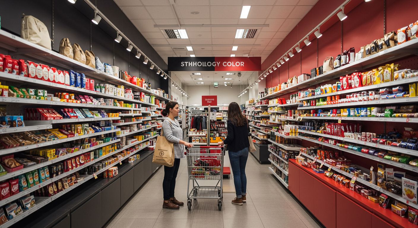
Color is one of the most powerful tools in your design arsenal. In my 20-plus years of manufacturing custom displays, I’ve seen it make or break a product launch. A client can have a brilliant structural design, but if the color clashes with the product or the brand, the whole project can fall flat. This is why every custom display we produce has very specific color requirements. It’s not just about what looks nice; it’s about creating a coordinated visual experience that attracts consumers. Getting that color perfect is a technical challenge, and it’s a huge part of what we do.
What is the psychology of color in the retail industry?
Are you picking display colors based on personal preference? This can send confusing signals to your customers and weaken your brand’s message, leaving potential sales on the table.
The psychology of color in retail is the strategic use of color to evoke specific emotions in shoppers. It’s about using red for excitement, blue for trust, or black for luxury to guide customer perceptions and encourage buying behavior.
At its core, color psychology is about communication without words. The colors you choose for your displays speak to your customers on a subconscious level. The goal is always to choose a color that both complements the product and reinforces your brand’s message. For instance, a display for a new organic snack should probably use greens and earthy tones to communicate health and nature. Using a jarring, industrial gray would create a disconnect for the shopper. It’s a critical factor that can make or break a sale.
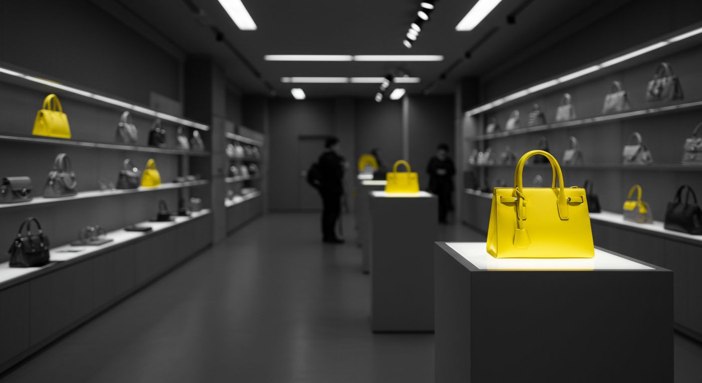
As a manufacturer, my team and I view color as a precise technical specification. Controlling this is one of our most important jobs. A designer might specify a very particular shade of Pantone blue to convey trust for a financial services kiosk. Our task is to replicate that exact shade perfectly. This is challenging because color looks different on different materials. The process for powder coating metal is completely different from applying paint to wood or selecting a laminate texture for a board. Our quality control team works tirelessly to ensure that the final color is consistent and accurate across every single display.
What is the best color for a retail store?
Are you searching for that one perfect color for your store? Believing a single "best" color exists is a trap. This approach can make your store feel flat and uninteresting.
There is no single "best" color for a retail store. The right choice depends entirely on your brand, your target audience, and the feeling you want to create. Luxury brands use black and gold, while health stores use green.
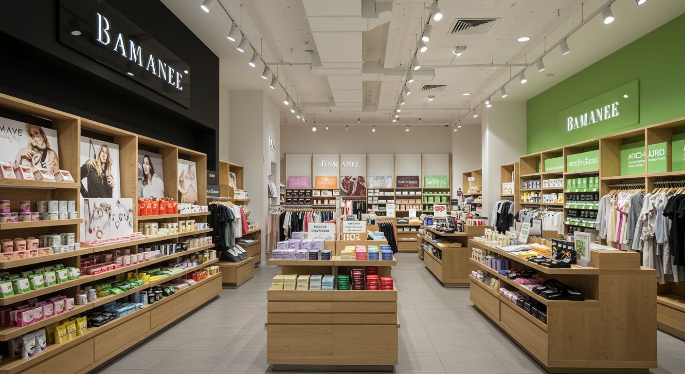
The idea of a single "best" color is a myth. The most effective strategy is to develop a color palette that tells your brand’s story. Different colors serve different purposes within that palette. You might use a calm, neutral color for the main walls and shelves, but then use a bold, exciting accent color for a specific promotional display to draw the eye. It’s all about creating contrast and guiding the customer’s journey through the store. My factory produces displays for a wide range of industries, and I see firsthand how different brands use color to achieve their goals.
Here’s a simple breakdown of how different colors are typically used:
| Color Palette | Industries & Brands | Psychological Effect | Best For Highlighting… |
|---|---|---|---|
| Black, Gold, White | Luxury, Tech, High Fashion | Sophistication, Value, Modernism | Jewelry, electronics, designer apparel |
| Blue, Green | Health, Finance, Eco-friendly | Trust, Calm, Nature, Wellness | Organic foods, banking services, outdoor gear |
| Red, Orange, Yellow | Food, Clearance, Entertainment | Urgency, Appetite, Optimism, Fun | Sale sections, fast food, children’s toys |
| Pink, Purple | Beauty, Youth Brands | Femininity, Creativity, Whimsy | Cosmetics, candy stores, creative products |
What are the 4 psychological colors?
Do you feel overwhelmed by the endless number of color options available? Trying to choose from millions of shades can lead to confusion and a chaotic design.
The four primary psychological colors are Red, Blue, Yellow, and Green. They relate to the body, the mind, the emotions, and the balance between them. Focusing on these four provides a strong foundation for any color decision.
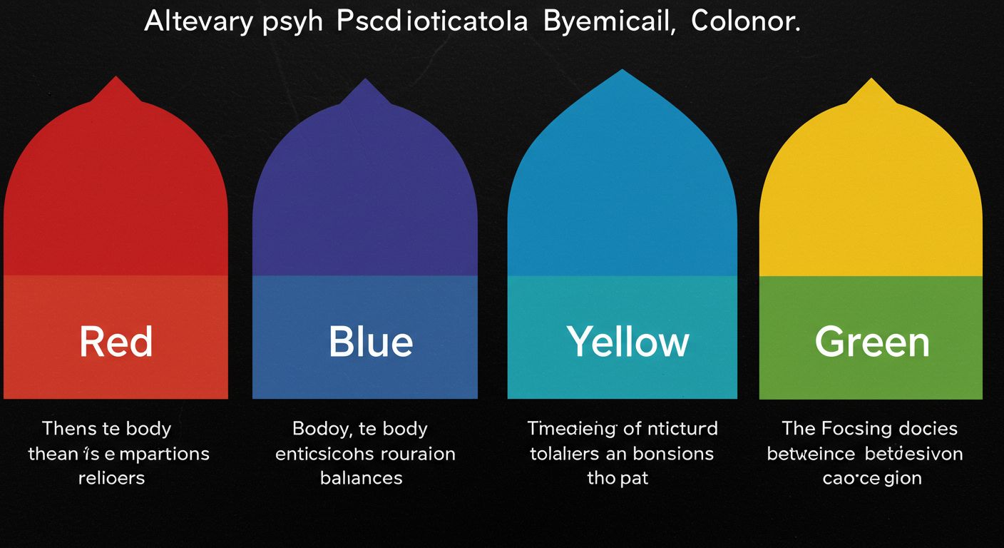
Thinking about these four core colors simplifies everything. They represent our most fundamental human responses. You can think of almost any other color as a blend of these, with a corresponding blend of psychological effects.
Red: The Body
Red creates a physical reaction. It can increase pulse rate and creates a sense of urgency. It’s powerful and grabs attention like no other color. This is why it’s the perfect choice for "Sale" signs and "Buy Now" buttons. Too much red, however, can feel aggressive or stressful.
Blue: The Mind
Blue is the color of intellect and trust. It has a calming effect and makes us feel secure. It communicates logic and reliability. This makes it ideal for technology companies, financial institutions, and any brand that needs to establish credibility.
Yellow: The Emotions
Yellow is the strongest emotional color. It’s optimistic, cheerful, and creative. It’s great for grabbing attention in a cluttered space. But be careful, as too much yellow can create feelings of anxiety. It works best as an accent color.
Green: The Balance
Green strikes a balance between the other three. It is restful and easy on the eyes. It signals nature, health, and harmony. This makes it the obvious choice for organic products, wellness brands, and anything related to environmental sustainability.
What is the color theory of merchandising?
Are you just picking colors that look nice together without a clear strategy? This can result in a display that is either boring or visually messy, failing to highlight your hero products.
In merchandising, color theory is the art of using color relationships to create visually appealing displays. Strategies like using complementary or analogous colors help guide the customer’s eye and create a specific shopping atmosphere.
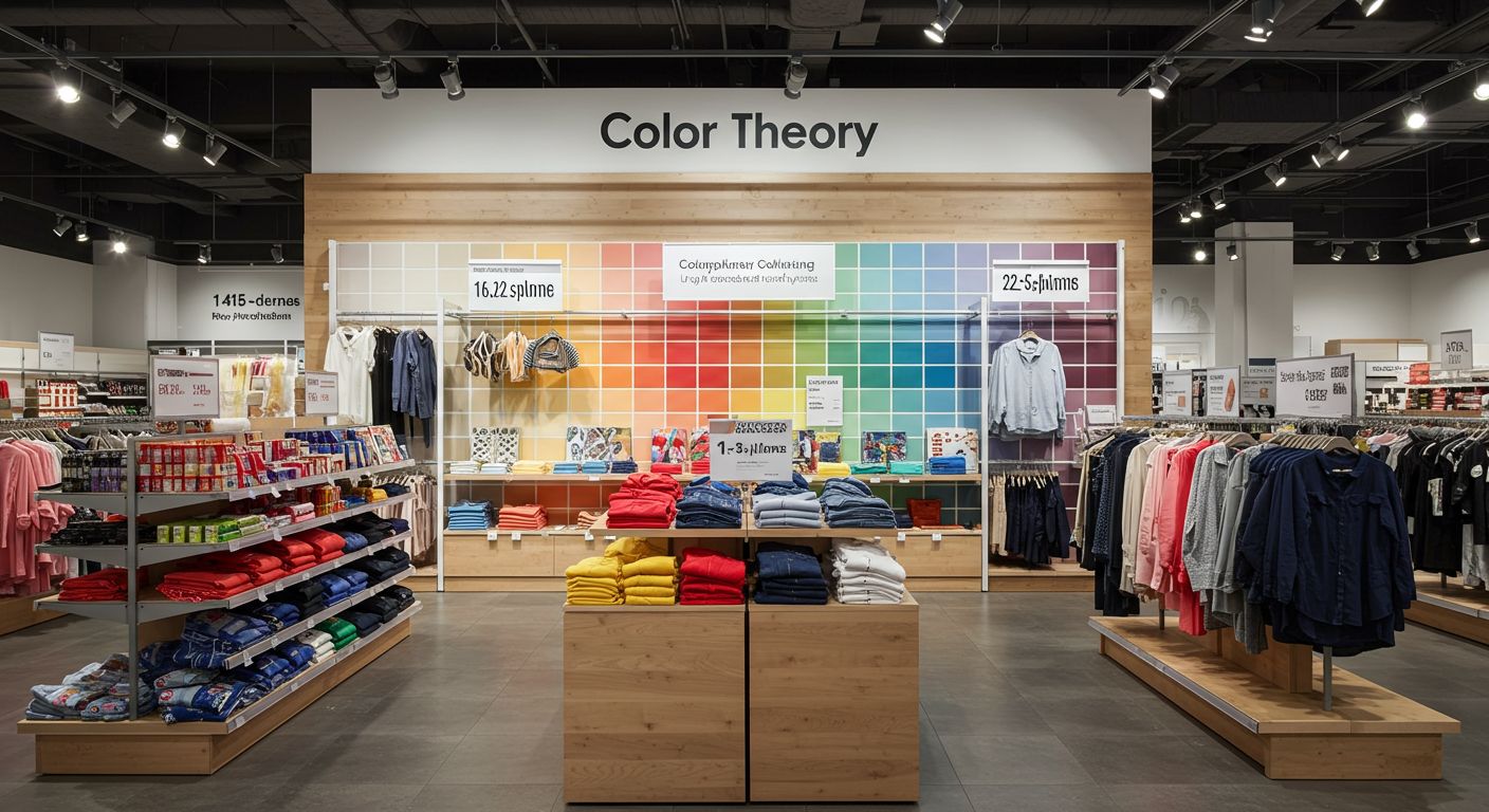
Color theory gives you a simple rulebook for combining colors effectively. Instead of guessing, you can use these proven relationships to create a professional and effective display. I work with designers who use these principles every day, and it’s my job to bring their vision to life with perfect color accuracy.
Here are the three most common strategies we see:
Complementary Colors
These are colors that sit opposite each other on the color wheel, like blue and orange, or red and green. This combination creates the highest possible contrast. It’s very vibrant and makes things pop. This is a fantastic strategy when you want to draw a customer’s eye to one specific, high-margin product.
Analogous Colors
These colors sit next to each other on the color wheel, like a palette of blues and greens. This approach creates a very harmonious and serene feeling. It’s often used by high-end brands to create a calm, comfortable, and sophisticated shopping environment where customers feel relaxed and are happy to spend more time.
Triadic Colors
These are three colors that are evenly spaced on the color wheel, like red, yellow, and blue. This combination creates a display that is vibrant and dynamic, but still feels balanced. It has a lot of energy and often appeals to a younger demographic.
Color is a silent salesperson. Using psychology and color theory turns your displays into powerful tools that attract attention, build trust, and drive sales. A great manufacturing partner makes it real.